
Facebook’s New Look
Last May 2019, during the annual F8 developer conference. Facebook teased its audience of a brand-new Facebook look. This drastic change promises to give us a fresher, and simpler user experience. The new interface immediately began rolling out on the mobile version. But we were all left hanging on the edge of our seats, as the update for the desktop version is promised to come out in the next few months. It is safe to say that now is that time for this morning, as I was busy scrolling through my newsfeed. I received a notification prompt which invited me to try the new Facebook design. I was thrilled and excited, so I thought of sharing my experience with you guys. Here’s my rundown on the 3 major changes that I noticed from the new design of Facebook’s desktop version.
One of the most notable changes in this update that you’ll first notice is the dark mode option. Right after accepting the invitation, I was asked if I’d like to proceed with a white or dark theme. THIS IS A GAME CHANGER FOR ME because if we’re being honest, Facebook’s white layout is straining in the eyes. The dark mode, when activated, reduces the screen brightness of the interface and inverts the color of the screen. This feature will make nighttime viewing easier for users. I can see myself overusing this feature because I’m very guilty of using the application in bed before going to sleep, I mean who doesn’t?
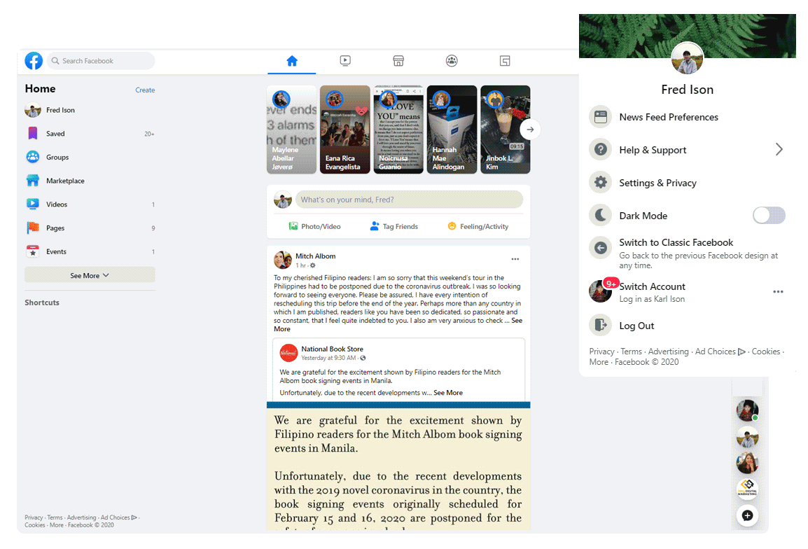
This is a screen capture of how the Dark Mode feature looks like. By pressing the switch, the mode will be activated and a whole new experience unfolds right in front of you.
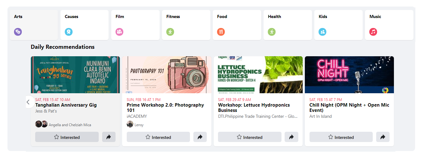
Another change that I was able to observe is the redesign on the events page. This brand-new look highlights the categories of the events which might interest you. The interface also provides daily recommendations, and it also lists down events that are about to happen soon. If you are a person who is fond of attending events, the calendar feature will be a big help for you. This feature shows you all your upcoming events on a calendar view. One important thing that I also noticed is that by default, it is going filter and only show you events that are going on near you. If this is a bummer for you, you can always adjust the settings to change your location. This brand-new design makes the events feature more engaging, interesting, and interactive.
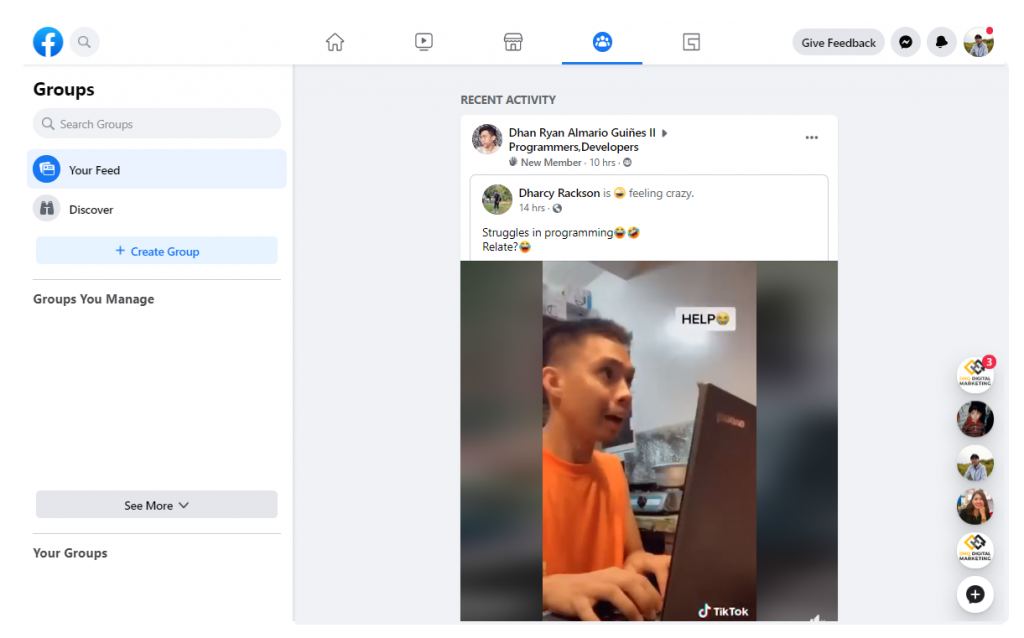
Lastly, navigating through the menu on the top of the desktop page, I noticed a dedicated group icon. The Facebook group is now highlighted on the main menu, making it appear as a prominent feature of the platform. Upon pressing this button, I was surprised to be redirected to a view like my newsfeed. Except that this one specifically only shows me recent activities and posts from the Facebook groups I belong in. I think this is a great way to filter the things you want to get updates from. I never thought of needing a feature like this, but now having one I must say I really like it. I can now have a view of all the funny cat and dog videos from all the video-sharing groups I belong in!
To sum it up, this brand-new design is something I still must get used to. It appears seamless, clean, and the placement of elements make it easier to navigate. The new aesthetic feels more in line with its mobile version, and with Instagram. Although it sometimes looks confusing, and the view seems to be more compressed. The improvements in the groups, events, and the presence of the dark mode option are enough reasons for me to be optimistic about this change. If you also got prompted by Facebook’s website to try their new look, what’s your opinion on this matter? Share your thoughts below, let’s have a discussion.
To sum it up, this brand-new design is something I still must get used to. It appears seamless, clean, and the placement of elements make it easier to navigate. The new aesthetic feels more in line with its mobile version, and with Instagram. Although it sometimes looks confusing, and the view seems to be more compressed. The improvements in the groups, events, and the presence of the dark mode option are enough reasons for me to be optimistic about this change. If you also got prompted by Facebook’s website to try their new look, what’s your opinion on this matter? Share your thoughts below, let’s have a discussion.